So finally you have made up your mind now. You need a new website. It could be your personal website or your business website. But, at least, there is a certainty that a website is required.
Now the next logical question is, what are the essential web design considerations that you need to keep in mind? Ever wondered, the web design tips you need to keep in mind to get a good website?
After all, you need an effective website that achieves its objectives in the long run. Or for that matter, in the short run too. After all, why shouldn’t you expect your website to deliver in the least possible time frame?
When you work so hard, your website should also do the same for you.
I am going to talk about some essential web design tips that are easy to follow and implement. Keep those in mind when discussing your project with a web design company.
Tell them that you want these tips to be implemented. And I am confident you will end up with a site that your users will love, and will help you get closer to your objectives faster.
Let’s look at the web design tips now.
Tip #1: Don’t make it all about you!
If you notice above, I said, your users will love. I didn’t say you will love it. It is possible that you too will love the site. But that is not a necessity.
The most important advice I can give is NOT to make it all about you. With my experience, I can tell you that many times we don’t give the importance, that website designer truly deserves. We don’t do that to a doctor or engineer though. But when it comes to a web designer, we think we can tell them exactly what to do.
Why? Because many consider themselves no less of a designer themselves. After all, they have tried their hand a few times on paint. And they think they did a good job of it too.
Remember, when you design a website, you are ultimately designing it for the end user. Forget about what you like! And stay focused on your objectives. It is easier said than done though. Personal bias is so difficult to get over with.
We get clients all the time, asking for the logo to be made one centimeter bigger. Or to move it a tad to the right. Sometimes to the left, move it up, down etc. These demands are not illegitimate if they come with a valid explanation on how it is going to help them achieve their business goals better.
At times we are forced to ask this to the client. Their usual response is, “I think it would make the site look better.” So you see it is all about I. We would be more than happy to make the change if it would lead to even a minuscule increase in sales. But it is not about objectives, it is about personal bias.
The more you understand this, the better your site will be.
And for God sake, don’t tell the designer, your nephew could have done the site. That you are doing a favor by giving him the project. In such a case, you might as well give the project to your nephew and see what he does with it.
You will need to keep in mind that your web designer has been in business for a long time. They have acquired knowledge & expertise that you don’t have.
The right strategy is to tell your web designer what your business objectives are. And ask them to design a website that aligns with your goals.
Aesthetics are definitely important and they should not be overlooked. But at the same time, you need to think about User Experience (UI), browser compatibility, the different devices your target users will be using, user engagement, minimizing bounce rate, call to action, SEO, conversion rate optimization, content promotion and much more.
And the design, layout, placement of elements could affect all of the above.
Let us move on to the next web design consideration.
Tip #2: Good User Experience
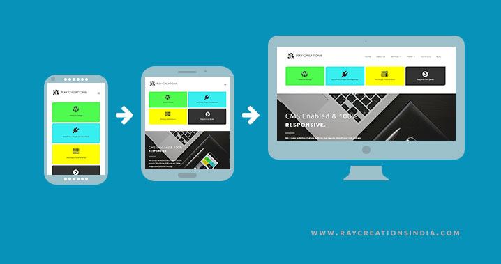
Again it is all about the user. We want to give them a good experience while on our site. I wrote an article here on user interface design and how it can be used to improve the user experience (UX), which you can go through, if you want to read about it in detail.
So what steps can you take to ensure a good user experience? You must take care that interacting with the website interface is effective, efficient, and satisfactory.
Effective would mean easily accomplishing the task the website visitor wants to perform on the site. Efficient would mean, doing it in a streamlined fashion, involving the least number of steps, and without confusion. Satisfactory would mean, an overall pleasant experience.
All of the above is necessary if you want your visitors to come and stay on your site. Getting visitors to your site is one thing, and keeping them there is another.
Unless the site is designed intelligently, you would have a hard time keeping the visitors long enough on your site to make any difference to your sales.
Some of the things to take care of to provide a better user experience include:
- Design should appeal positively to your emotions. – Emotions do play a major role in deciding what you do when you are on a particular site. It could have a major impact on whether you decide to buy, sign up for that newsletter, or simply leave.
- Design should be intuitive & easy to understand – All visitors are not tech savvy. The more intuitive the design is, the easier it will be to understand how to perform a particular task. This could include filling up the quote form and signing up for the newsletter. Pretty important stuff, so it makes sense to keep the interface intuitive.
- Consistency in design throughout the site. – A consistent design makes for a pleasant user experience.
- Let the user always stay in control – Don’t take away the control from your users. Though it sounds obvious, it is still important enough to need a mention. How do you take away control from your users exactly? It could be a dialog box that is not dismissable unless the user performs a specific action. Here you are forcing them to take a particular action. These create a bad user experience and should be avoided. Always give the user choice.
- Streamlined navigation. Reach all inner pages within fewer clicks. However, < href=”https://www.gravitatedesign.com/blog/user-satisfaction-fewer-clicks/” target=”_blank”>many do not adhere to this idea. But common guys, shouldn’t it be better if something is easier to find? If my life depended on it, I would go down to the bottom of the ocean to look for it. Otherwise, I will just move on to the next available option. Wouldn’t you?
- Optimized mobile version of the site. – Your website users are both on desktop and mobile. So it makes sense to take care of the user experience of your mobile users too. It should be a part of a good Responsive web design.
These are definitely not an exhaustive list but should give you an indication on what can impact a user’s experience on your site. These are some of the steps you can take to make it pleasant for the user. At the end of the day, taking care of these steps can translate into more business for you.
Let’s move on to our next web design consideration.
Tip #3: Business Objectives
These are expectations that a business or an individual set for themselves, to be achieved within a specified timeframe. A goal can be anything at all. It can be anything that makes your efforts worthwhile.
Knowing what you want to achieve can make the website more effective. You can then look for ways that your website can directly or indirectly help with achieving those goals for you.
Some organizations follow the SMART goal model. It stands for the following:
- Specific: Define your goals as precisely as possible. They must be specific.
- Measureable: Meaning it must be quantifiable. If you are not able to measure it, you will not be able to track progress.
- Achievable: Goals should be realistic and achievable within a given timeframe and available resources.
- Responsible: Assign responsibility. Determine who will do what.
- Time-related: Without a timeframe, a goal does not have any value. Specify a timeframe within which specific goals should be realized.
These are some of the characteristics that a S.M.A.R.T. goal must have.
Some examples of business goals could be to cut down on expenses, increase website conversions, reduce bounce rate, increase the number of emails & social media subscriber, generate a certain amount of leads per month or year, increase revenue etc.
Of course, you need to assign specific numbers to those goals, and a timeframe.
But once you identify the goals that your website will directly or indirectly help your business with, it becomes easier to design it. And it will be more effective in achieving those objectives for you.
Tip #4: Identify your target audience

Identifying your target audience is the first step to knowing who to design the website for. If you design the website just for the sake of it, it wouldn’t convert the way you want it to. Afterall, if it does not convert, you don’t make money.
If you are not in the pageview business, it matters who are visiting the site. Getting a lot of traffic from a segment that is not interested in your products or services will only take up your bandwidth and increase your cost of hosting.
Not to mention it will skyrocket your bounce rate too.
Why is it important to know your target market?
First of all, identify who your website audience is. Because then you can make the website so that it appeals to your end users.
If you know who they are, then you will know the sites they visit, the blogs they read, and the keywords they search for in Google. You can then prepare your site in a way that can capture your audience’s attention.
It also gives you an opportunity to create the website copy in the language that your audience speaks. This will make them more comfortable and they are more likely to convert.
It will also give you an insight into what your audience wants. What their likes and dislikes are. You will understand their pain points and will be able to offer better solutions.
Here is an interesting article from Peep Laja on this topic.
Let me move on to our next tip.
Tip #5: Different types of website design: Which is right for you?
This is another area that shouldn’t be overlooked. Because once the website is ready, then there are not many options to go back and change it, without redesigning your website.
You may like: Website Redesign SEO Checklist & Considerations
So it is always better to make an informed decision prior to moving ahead with your website making decision.
So, what are the different types of websites you can opt for?
I am listing a few of them below:
- HTML Websites:

These are websites that do not give you the option to edit them. They don’t have an Admin Dashboard to create new page or posts. So all the information you need is hard coded into the web pages. It is also difficult to edit existing website content. Not very convenient if you intend to add content on a regular basis.
- CMS Websites: Content Management System (CMS) based websites are widely used these days. Because they are very reliable, affordable, and easy to use. They have lots of benefits over HTML Websites. They make adding content to the website very easy. They take care of many of the SEO considerations like friendly URLs, canonicalization, Title tags, Page descriptions etc.
- Ecommerce Websites:

If you have something to sell, you can opt for an ecommerce website. They are designed specifically to facilitate the selling of physical and digital goods online. There are many ecommerce platforms you can choose from.
- Responsive Websites: Responsive websites are basically mobile friendly websites. They can adjust the layout according to the device on which it is being viewed on. Since it is more like a new website feature, it can be paired with HTML, CMS, or Ecommerce websites. It is indispensable in providing a good user experience for your mobile users.
You should choose the type of website that aligns best with your business objective.
Tip #6: Current web design trends
It is not a bad idea to look at some latest web design trends for inspiration. After all, it is not everyday you design a new website.
Looking at what other people are doing in your niche is very important. Especially the ones that are very successful in what you want to do. If they are doing it well, they must be doing something right. And you want to know the things they have implemented on their site. So that you can make an informed decision on the components that want to include on your site and the ones that you want to leave out.
Not only will you get inspired, but you will learn many new web design tips & ideas.
Tip #7: Choosing A CMS
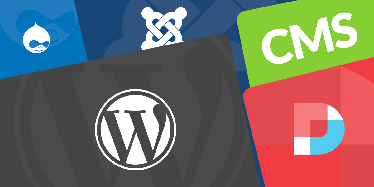
If you want to opt for a site that you can manage on your own, you will need to go with a CMS website. But there are many CMS platforms on the market today. Which one do you opt for your site?
Which CMS should I use? That is a difficult question to answer. I will give my inputs below to help you make a decision.
WordPress seems to be far ahead of the rest. And it would be wise to opt for a CMS that so many people have chosen to trust. I wrote an article here on why WordPress is the best CMS for your website.
The other contenders would be Joomla and Drupal. They too have some ardent fan following and people vouching for them. And they are not bad, you can use them if you like, and still, have a very pleasant user experience.
But WordPress far exceeds in popularity. We tried our hands on Joomla many years back. But found it quite difficult to setup and use. Too many files to start with in the first place. So the initial files itself made it quite bulky.
WordPress on the other hand just has the bare necessities to get started. Most people don’t need anything more than that. And if you do, you can always find an appropriate plugin and install it to add that feature. This helps WordPress stay lite.
However, I haven’t used Joomla for a long time. It is quite possible they have changed quite a bit over the years.

Drupal, on the other hand always tried to portray a very geeky image. Something that only real developers could understand. It was targeted towards developers. And many vouched for it. Giving it the certificate of the most secure CMS platform. I am not an authority on security, so can’t really tell.
But WordPress, on the other hand, is super easy to install and use. So I am a fan of WordPress you can. After all, it helps me run a company designing website built on WordPress.
Let’s move on to the next web design tips to look out for.
Tip #8: Create a Website Blog
Now it may not sound like a fun thing to do. But it can definitely help you generate more sales and revenue for your business, in more ways than you can think of.
Blogging is one of the crucial steps of inbound marketing. It is a marketing strategy that uses the pull technique to attract visitors to your site. I love this technique, as it can generate sales and revenue while you are sleeping or on your vacation.
Blogging helps with SEO, as you end up having more pages targeting relevant keywords. So more chances to show up in the search.
Blogging also helps keep the content fresh, and Google likes that.
Related article: Blogging for Business: Generate Long Lasting Traffic & Sales
Tip #9: Mobile Friendly Website Design: Responsive Website Design
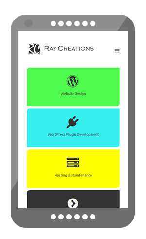
This is no longer an option. You cannot say, I will only take care of my site users on desktop and ignore mobile users.
Because today everyone is on mobile. Consider how many times you visit websites on your handheld devices! When you are commuting to and from work on the tube, on the train, plane bus. Heck, even sitting in the park or in your favorite cafe.
We do it all the time. Think of last time you surfed the net on your mobile. Hey, are you reading this on your mobile?
If your site is not mobile friendly, it will not display well on mobiles. It will frustrate your users. And you don’t want that. You want the website visitors to love your site and stay on your site longer. In turn reducing bounce rate, and giving it an SEO boost.

Being mobile friendly itself is an SEO factor that influences rankings favorably. You can test whether your website meets Google’s mobile-friendly criteria here.
Related articles:
Why Your New Website Should Be Responsive
10 Reasons Why Mobile Optimized Website Helps Grow Your Business
Tip #10: Social Media Integration
Social media is indispensable. So you need to devise a strategy to take full advantage of this method of marketing for your site.
Listing some social media platforms that you just can’t ignore. Your business must have a presence on these social platforms:
I have linked to the relevant pages, where you can quickly go and create a business page. This lets your business have a social presence. Your potential customers, customers, fans, visitors get a chance to know more about your business. And if they choose to stay connected, they can join your page.
So whenever you update your social business page, your subscribers get notified. This helps you stay connected with your audience.
This seems like a lot of work, but as they say, no pain no gain.
Videos are an excellent source of new business leads. People love watching videos. You can listen and watch at the same time. Without much of an effort, like if you had to read the whole thing. That is why YouTube is so popular today.
By the way, the above list is just to get started with. Remember, the more places your business can found, the better for you.
Tip #11: Choose Domain & Hosting Wisely
I also wanted to touch upon briefly on this point. Not much thought is given to it, but it impacts your website & business in more ways than one.
My top advice is, acquire the domain from a reliable source. This is the cheapest, but the most important component of your website. It is your business address on the internet. You lose it and you lose everything.
Just like you have an identity, your domain name is your business identity on the internet. That is how important it is.
Your hosting is like a house where you domain resides. So the better the house, the better the reputation and performance for your domain.
Hosting can be quite expensive if you go with VPS or dedicated servers. But it is up to you to make a call on how important the domain (your business identity) is, and what kind of house it should have.
The faster the server, the faster the website will be. Faster servers mean happier visitors, having to wait for less for pages to load. That in turn, keeps them longer on your site, decreasing bounce rate, and increasing conversions.
Page speed is a known factor to influence SEO positively. You can check your page speed here.
Tip #12: Content Is King: Keep It Original
I don’t know who said that first, but it is so true when it comes to your blog or website. Content truly is king.
You may have the best-looking website in the world. But if your content is shallow, or god forbid, stolen/copied, you are doomed.
First, it is unethical to copy someone’s beautiful work. If you ever need to reproduce something, it is always best to ask for permission first. And then give them the due credit for their work in terms of linking back to their website or that piece of content.
Second, copying something does not add any value to what is already out there. You not only hurt yourself, but you could also hurt the rankings of the website you copied it from.
Third, creating original content entices others to come and read more often from your site. If they like it, they will also link back. Sometimes, they will reference your work from their work.
Content can be in the form of text, images, infographics, pdfs, videos, podcasts etc.
So when you create original content, you are actually helping yourself more than anything else.
It is somewhat of a hard work to create original content & requires a lot of dedication. But hard work & dedication always pays off.
Conclusion
Those are some of the important web design considerations that you should keep in mind when going for a new website design.
If you follow these web design tips, you won’t go wrong with your new site. Some of them can be thought of as common sense to many. But then again, common sense is very uncommon among the common people.
I am no way implying that you are common. But going over the points will reinforce the knowledge you already have, and acquaint you with the ones you didn’t.
It will all go towards a great website that helps achieve your business objectives.
That’s all from me. Looking forward to your comments and feedback.

very informative
Thanks a lot 🙂